Mario v Zelda Sales: Interactive Dashboard
This dashboard evaluates the sale performance of Zelda and Mario for a collection of games that were headlined by the two characters. This data spans from 1983 to the present and shows performance across individual games and console platforms.
Please interact with the data below.
You can see from the data viz that this was built on Tableau. The workbook is a collection of 6 pages.
This data was collected from a variety of sources using Excel Power Query. I found the data on game releases from Wikipedia. I cross referenced this data with units sold on VGChartz.com. This site has a huge collection of data in terms of sales performance across singular titles. Images were collected using Google Image Search. Other data sources were MarioWiki. Also, Metacritic was used to get game review data. The data was joined with Tableau to link the ratings to the games.
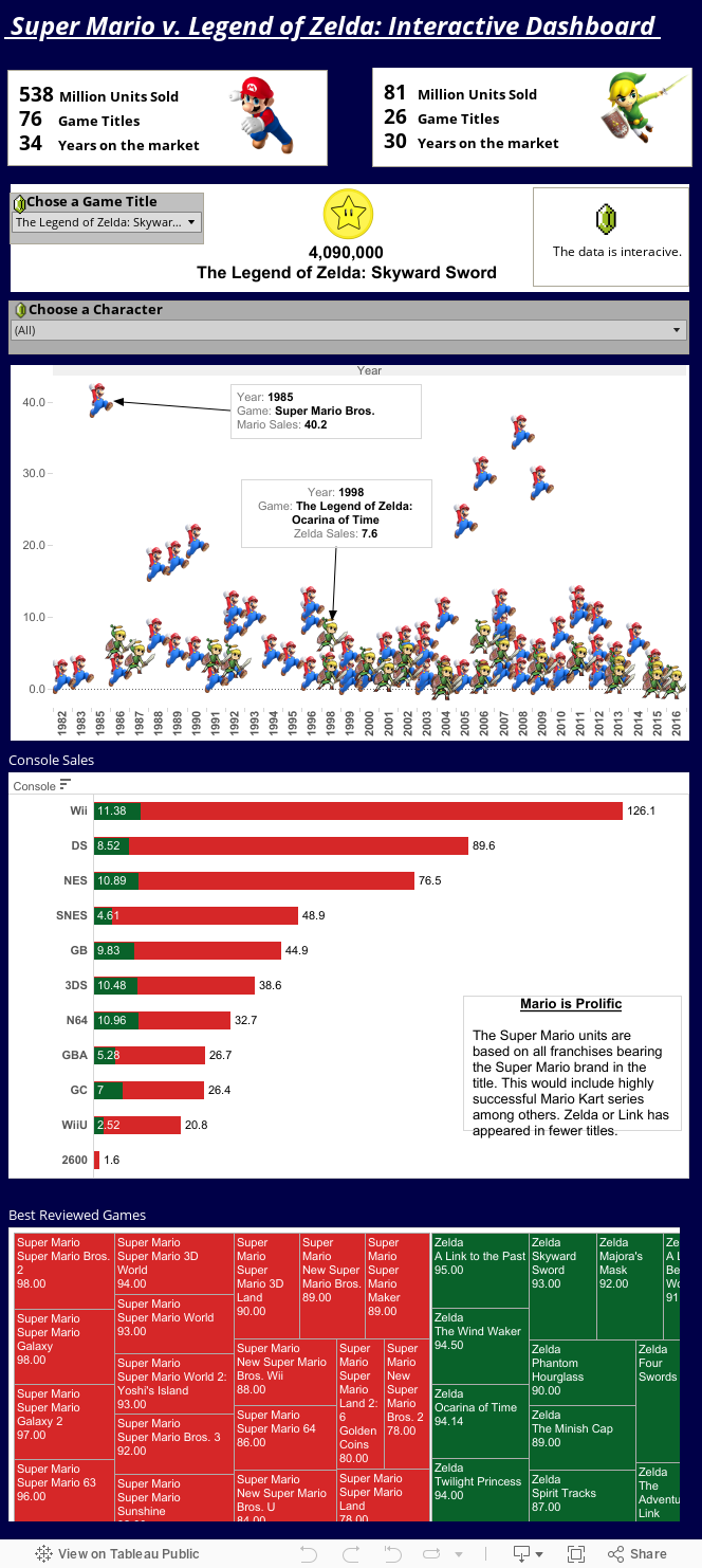
Mario and Zelda Sales
The first viz was the Mario and Zelda overall sales graph. This was created by adding all the data into Excel for both Mario and Zelda series. I put the year in the dimension shelf and added two measures for Mario Sales and Zelda Sales. The measures were not aggregated to have individual marks. This marks were changed to shapes with pre-loaded images of Mario and Zelda characters. A filter was created to distinguish the two. The game titles were added to the tool tip.
Sales by Consoles.
This was created using the console in the dimensions shelf and the sales in the measures shelf. Two graphs were created using Zelda Sales and Mario Sales. These were then combined using the Dual Axis and synchronized. The color was formatted.
Game Sales Selector.
First a parameter was created that allow the user to match all games to the string values for each game. I created this using a calculated field with an IF formula. If the user selected the Parameter matched the Game Title, then I wanted Game Sales returned. Then, I put this calculated field in the shelf and used shape as the mark. I used the coin found in from Google images.
All these sheets were added to a dashboard. I added some additional summary information and images at the top.
This was very interesting and helpful. Your effort is appreciated.