Best US Counties to Find a Partner By Gender and Income
no code needed
Other Visualizations
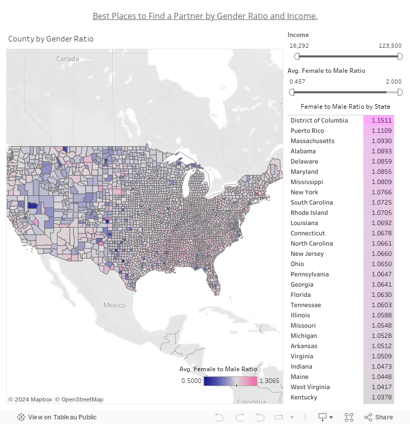
Have you ever wondered where you should live in order to have an edge on where to find a partner? Well you can increase your chances by living in an environment where there is a higher ratio of men to women or vice versa. Also to pair that variable with the per captia income give some great insight into your part of the world. So, I have created a interactive dashboard that allows you alter the income and gender ratio. The data is sourced by census bureau which has the per captia income and gender statistics. A custom ratio was created to get the gender ratio.
How I made this visualization.
After getting the data from census data records. I imported into Tableau. I created a custom calculation for the female to male ratio. I was able to make filters that allow the users to filter from income and average female and male ratio. Three report sheets were created. One with the map that average female to male ratio was placed in the measures shelf. I users a conditional color scale to indicate where there was a low ratio of female to male ratio. Blue was used for more male and Pink was used to female. All this data was placed in a dashboard.