How to Make a Tree Map in Python
Often we we want to show the size differences for groups, we can use things like a tree map. A tree map plot doesn’t come out out the box with the traditional plots such as Matplotlib and Seaborn.
The tree map provides a visual representation of the various proportions of categories, much as a pie plot, bar plot, or donut plot. Large number of comparison categories be highlighted more effectively than pie plot. From an audience standpoint, it can be perceptually challenging to understand more than 5 categories in a donut plot. The three tree map makes it simpler for us to immediately understand how categories are compared.
Let take a look a simple example:
#Load in the essentials
import matplotlib.pyplot as plt
import seaborn as sns
import folium
import squarify
#import the dataset
df = sns.load_dataset('tips')
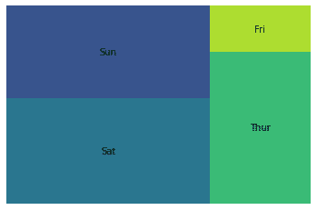
# lets create the grouping
y = df.day.value_counts()
#lets plot and remove the axis
squarify.plot(sizes=y.values,label=y.index)
plt.axis('off')
We can use the same code but this time changing the seaborn dataset to diamonds dataset from Seaborn
#Load in the essentials
import matplotlib.pyplot as plt
import seaborn as sns
import folium
import squarify
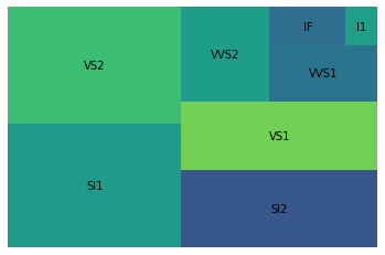
#import the dataset
df = sns.load_dataset('diamonds')
# lets create the grouping
y = df.clarity.value_counts()
#lets plot and remove the axis
squarify.plot(sizes=y.values,label=y.index)
plt.axis('off')
Lets add labels to our treemap, so that we can see the portions on the treemap.

# load in another dataset with pandas
import pandas as pd
#new dataset with ecommerce data
df  =pd.read_csv('https://raw.githubusercontent.com/Gaelim/google-data-stuido/main/Ecommerce_Data.csv')
#check the grouping
#save the grouping
y=df.Country.value_counts().head(10)
#create a labels
new = [str(round(i*100,2))+'%' for i in y.values]
labels = list(y.index+"="+new)
#plot and stylize
plt.style.use('dark_background')
plt.rcParams.update({'font.size': 25})
plt.figure(figsize=(15,8))
squarify.plot(sizes=y.values,label=labels,alpha=0.6)
plt.axis('off')